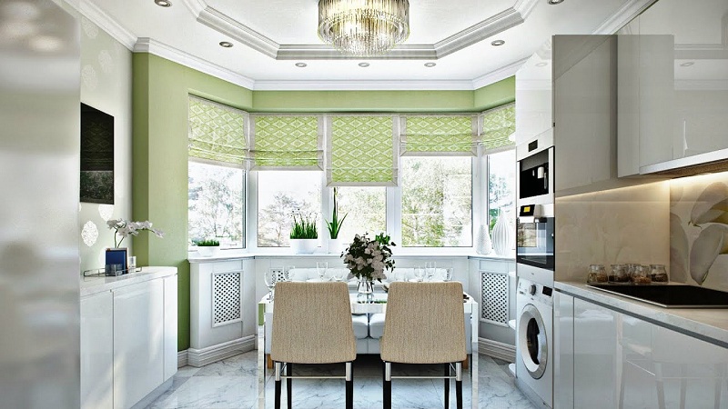
Undoubtedly, the kitchen with a bay window has a lot of advantages – it is lighter, larger and more status than the kitchens of the standard configuration. And if it is also combined with the living room, it seems that ideas for a unique design should gush. But what do we see when studying magazine photos and real interiors of kitchen-living rooms with a bay window? Quite a banal layout, ordinary furniture, and decorum. But in fact, the kitchen can be turned into a zest of a private house, its communication center, a place for family rest and welcoming guests.
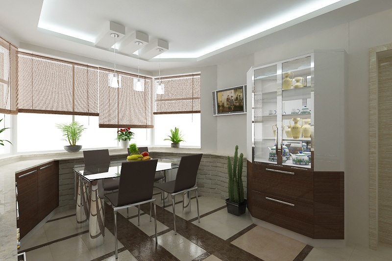
Decide on the functionality of the combined space
If the house is built according to modern standards, the kitchen-living room at your disposal has an area of at least 20-30 square meters. The apartments and private houses of the old design often cannot boast with such luxury, and you, as a newly-made designer, need to squeeze in your requirements and wishes in 14–15 square meters. m. Of course, the size of the room imposes its limitations on the planning decisions.
And in fact, and in another case, the first question that you need to decide is the clarification of the functions of the kitchen, living room and bay window. In other words, you need to answer yourself and ask your household about what exactly they like to do together. Believe me, not always the answers are obvious, and a well-planned kitchen-living room in the future will serve not only as a place for cooking and eating.
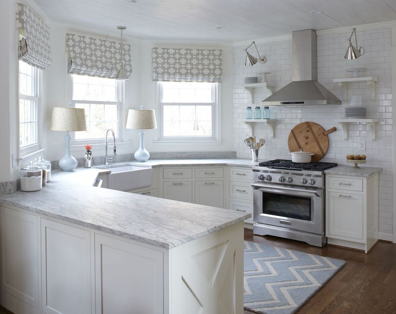
Here are some examples of the use of bay window space, which will be useful at the beginning of the reorganization:
- private recreation area or guest room – a folding sofa or armchair, curtain or screen is put in the bay window so that you can relax in a chamber setting or shelter friends of your house for the night;
- a study – if you want to spend more time with your family settling in the kitchen because the maximum amount of natural light penetrates here;
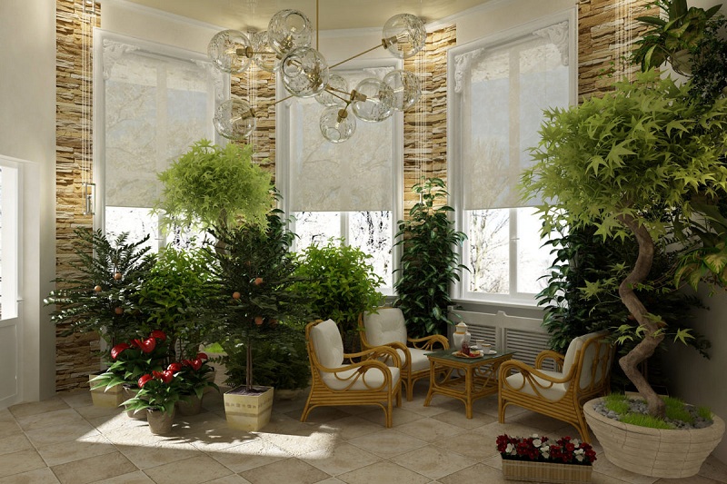
- home greenhouse – thanks to the good lighting in this part of the kitchen, ornamental flowers, garden greens, exotic cultivated plants, bearing fruit at any time of the year, grow perfectly;
- cooking zone – if the bay window area allows, you can put home appliances, kitchen, sink, refrigerator and do routine tasks while admiring the panoramic view;
- The storage space for the utensils is a low sideboard, placed at the very windows (provided that the bay window is partially glazed) does not take up extra space and can be a multifunctional piece of furniture.
If someone from the residents of a private house plays music, it is permissible to install a grand piano in the large living room with a bay window and thus equip a mini music salon in the spirit of an old manor. For grown-up children here you can equip the storage of children’s toys with side racks or a small convenient bed. Finally, not wanting to be wise, a dining or tea zone is organized in the bay window, and so that it does not look like a pattern, its design must be approached responsibly.
Plan the placement of furniture in the kitchen and living room with bay window
The placement of the dining room in the bay window is justified by economic considerations because you do not need to solve the complex and expensive tasks of transferring communications. True, the dining table and sofa still have to do to order, as it is highly desirable that their shape follows the form of a bay window. If one of its sides suits you in length, you can do with a straight-line sofa set along its line, but this number will not work with a radius bay window.
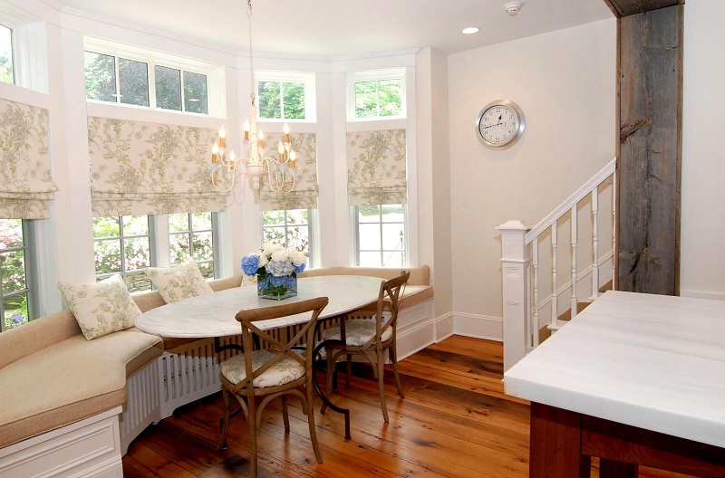
As for the location of the kitchen, according to the canons of design science, even with a minimum square of 14-15 square meters. m. almost any of the existing layouts will suit you:
- linear – used for arranging kitchens with walls less than 3.5 m long, allows you to organize comfortable storage niches (no corner cabinets and inaccessible areas), but does not allow to observe the ergonomic rule of the triangle;
- parallel – the headset elements placed along two opposite walls successfully adjust the wide kitchen combined with the living room with an arch or a wide aisle, in addition, there is plenty of space for installing all the necessary household appliances;
- L-shaped – when furniture and household appliances are placed along adjacent walls, a comfortable working area (cooking surface – sink – refrigerator) is created, which saves time and effort on cooking, but at the same time corner cabinets are inconvenient and expensive to manufacture;
- U- and G-shaped – are considered the most fashionable options for planning a spacious kitchen, implying full or partial use of three walls, including the one that forms the bay window (in this case, the dining group is taken to the living room);
- island – as the island serves the main or additional workplace, complementing any of the above plans and made to the center of the kitchen with a bay window, in addition, it serves as a functional separator between the living room and the kitchen itself.
Not sure which scheme to give preference? Resort to the help of an online planner, which will clearly show the advantages and disadvantages of each of them specifically in your conditions. From free and quite simple 3D graphics applications, PRO100, FloorPlan3D, Sketchup, Home Planner, or others may suit you. With their help, you will simulate the interior of the kitchen with a bay window in the shortest possible time, evaluate the virtual room and choose the best design option.
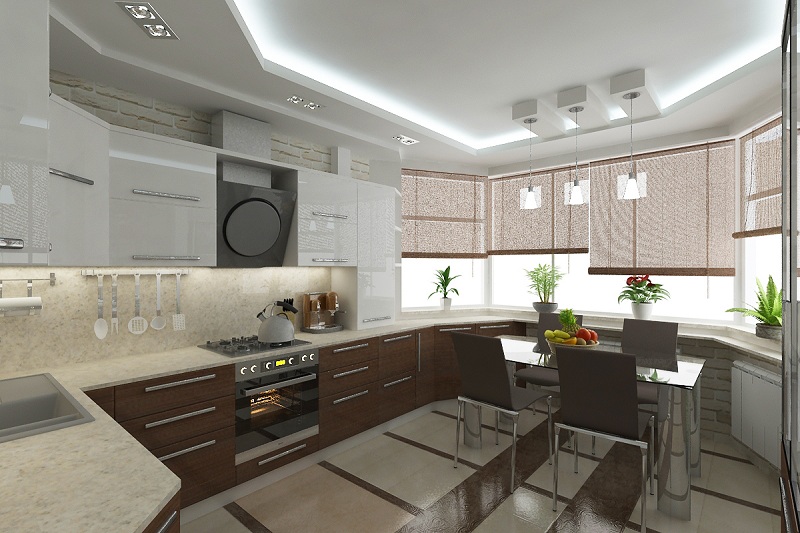
Design development – from the general style to small details
Now that planning decisions have been made, the time has come to decide on the design style of the kitchen and the bay window, select the finishing materials, the color palette, the proportions and the configuration of the furniture. For the sake of the good of the case, in advance, be prepared with a selection of photos with those that you and your loved ones like. Choose the best design for them or, even better; make a collage of several good photos. And in order not to go to extremes and not get a “gypsy” interior, immediately find out for yourself the stylistic direction that you will be guided by in the process.
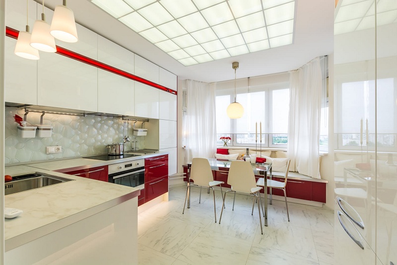
Stylish kitchen-living room interior: what does it mean?
Without having a clear idea of how and how different styles of interior differ, you risk instead of a spacious and comfortable kitchen combined with a living room to get a cluttered room with an inexpressive design that does not save even the presence of a bay window. So in advance familiarize yourself with the stylistic classification and “try on” one or another interior to your life.
To quickly navigate during the search, remember – with all the style variety they can be divided into 4 basic groups:
- historical classics (Baroque, Rococo, Empire, Renaissance, etc.) – people who like to emphasize their respectability like these design trends;
- modern classics (Art Nouveau, English interior, Art Deco etc) – so they prefer to decorate the kitchen with a bay window when they want to get expensive, but the not pompous interior with a high level of ergonomics and functionality;
- Ethnos and rural life (this includes Provence, Country, Scandinavian, Japanese and other similar areas) – they are suitable for those who soul to nature, a healthy lifestyle tends to a sense of freedom and avoids things.
- technological modern (hi-tech, loft, fusion, minimalism) – not only for young people but also for all dynamic people with a rational mindset.
The stylistic features of the first group are the abundance of decorative elements on the walls and ceiling – frame paintings, stucco moldings, borders, massive hanging chandeliers, ornaments, and wall draperies. Materials and furniture are selected luxurious, the flooring is almost always laid parquet with a complex pattern.
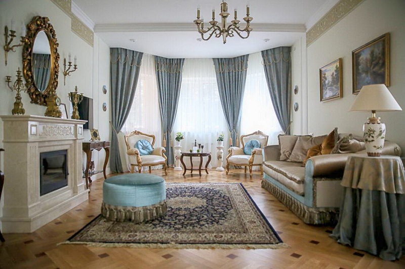
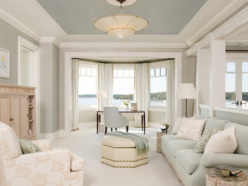
The classic interior in its more modern form preserves classic motifs, but at the same time, it is free from emphasized luxury. For him, you also need to select high-quality accessories and furniture, but they do not have to “report” about their value. Gilding is much less common, chrome and mirror surfaces are used instead, and pastel colors with bright accents prevail in the color palette.
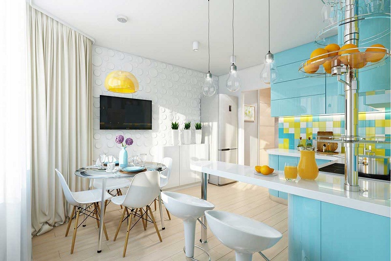
The provincial direction is characterized by deliberately coarse surface finish, an abundance of light (this is where the bay window is useful), large space. The decor is minimal – wood carving, wall drawings with a simple plot, ceramic products, homespun textiles. For the ethnic style, it is necessary to pick up a few characteristic elements. The floor is laid tile or wide boards, on the ceiling – massive beams, colors – the most natural.
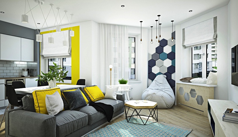
To implement the project of technological design help relevant materials – glass, plastic, metal. Interior lines are concise, which is compensated by a non-standard lighting system. Strict forms are combined with monochrome or, on the contrary, causing color palette. The decor is used carefully – everything must comply with the requirements of maximum functionality.
Interior antitrands
It is difficult for a novice designer to orient himself in the techniques and methods used by the pictures from the Internet. Many of them show interior trends that have already become obsolete, to which there is no point in resorting:
- bar counters – as practice has shown, these devices at home were completely useless;
- Color zoning – a game with multi-colored spots in the kitchen combined with a living room can only be won by a design pro;
- single-level lighting system – the light should be distributed throughout the volume, and this goal is achieved by installing devices at different levels;
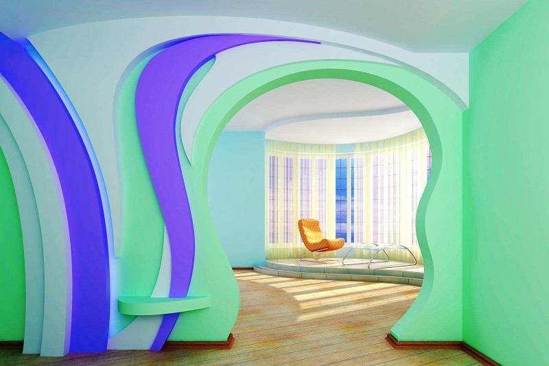
- drywall and multi-level ceilings – yes, indeed, lawmakers of the modern interior claim that their installation in a private house is considered a move;
- lambrequins and heavy curtains – massive curtains are already outdated, they should be replaced with light modern structures (Roman or roller blinds, organza, chiffon);
- the same type of furniture – just as the models on the runways do not wear shoes and a handbag of the same color; the stylish clothing is also welcomed in the interior;
- plasterboard arches and curly piers – where wood, brick, stone, glass look more interesting, and it’s better to forget about the arches between the kitchen and the living room.
Two key principles that should guide, independently engaged in the development of a design project, are as follows: avoid excessiveness and align the hotel with material and technical capabilities. There is nothing worse than trying to equip a miniature kitchen with a bay window in the Empire style or, instead of natural stone, for an eco-style to stack its imitation. If a beautiful solid picture does not add up from the selected photos, contact a professional designer – their services are not as expensive as is commonly believed.


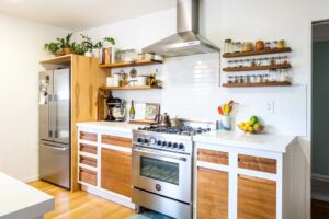
How do you feel about vintage-inspired kitchen spaces? I m not exactly sure why I added this one on this list, but I think I got pretty excited with the design of the bay window in here. The upper portion of the bay windows seems like skylights and it looks so lovely and fun!